Google Search Has a New Look: It Will Help Your Website More!

Google has announced that they'll be unveiling a new look for its search results. The company made the announcement on May 22, 2019, but says the new design will begin rolling out in the “next few days.”According to the announcement, the design is “coming first to mobile” and will include both web searches and searches on the Google app. This will be a noticeable change in how it displays search results.
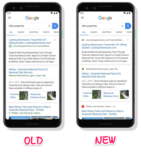
The new look includes a new presentation of text ads and organic listing and brings some branding to the search results. Meaning that the new design gives more deserved accentuation to the source behind each result and brings the publisher to the foreground. Until now, Google has somewhat always soft-pedaled the sources of search results, which have always been shown in small green font. Google also says this new design “allows us to add more action buttons and helpful previews.” Basically, this will prepare the mobile search for more types of content and actions for users to take while still on the search results pages. Remember, the search giant recently announced at Google I/O some of its plans for new search features, including AR in search results, better news coverage, and support for podcast search. It even stated that the latter will offer links for users to listen right in the search results pages as well as options to save the podcast for later.
NEW FEATURES COMING WITH THE UPDATE
Google calls the update a “visual refresh” as the key features coming with it are mostly visual elements.
The display of favicon
Probably, the first notable change is that the user will be able to see where the search result information is coming from, as the new design displays the site’s favicon/logo. Here's how Google sums it up in their own words: “With this new design, a website’s branding can be front and center, helping you better understand where the information is coming from and what pages have what you’re looking for. With the refresh, the source for the search result appears on top and includes the site’s own icon.”If your site has a favicon, you can set it up to be included in Google search results for your site.
To get your site's favicon displayed on an organic listing, first ensure that your site actually has a favicon. Your favicon should be a multiple of 48px square, for example: 48x48px, 96x96px, 144x144px and so on.Once you have this fixed, simply add a
tag to the header of your homepage with the syntax shown on this guide by Google. The guide has more details on how to define a favicon to show in search results. Once you have it set up, the next time Google crawls your homepage, it will pick it up and show in the search results.
The name of the website
You’ll also notice that the site name and breadcrumbs appear in the black text next to the favicon in this new design. Both of these items (favicon and site name) are displayed above the title link.
According to Google:
“The name of the website and its icon appear at the top of the results card to help anchor each result.”
Prior to this redesign, the name of the website and breadcrumbs were displayed in green text below the title in smaller font and there were no icons or logos.
No more gray line
Google has also taken off the gray line that used to be below the organic titles and ad headlines. This gives each card a more singular look unlike before.
Black “Ad” label
Another key feature is Google’s new black “Ad” label. If you've been following search marketing closely in the last months, you might have noticed that Google has been experimenting with a black and label for several months now. This style of ad display is now officially here with this new search result page design.

The last time Google changed it was in February 2017, when they went with a green outline ad label. The label now appears at the top of the ad along with the ad URL which is also in black text. It is now appearing above the ad title for the first time.
Google puts it:
“When you search for a product or service and we have a useful ad to show, you’ll see a bolded ad label at the top of the card alongside the web address so you can quickly identify where the information is coming from.”
HOW DOES THE UPDATE BENEFIT YOU?
Because that's the most important thing, right?
First of all, this new look puts website owners and content publishers on a balanced point as Google will now show more information — site name and favicon — about where search results are coming from. This is great for branding and being that branding is about your business identity, you can be sure that more users will get to know your business. Another thing is that the new update will allow Google to display more formats of content in the search results, including videos, 3D objects, hi-resolution images, and the types of actions it enables right from the search results (like listening to or saving podcast right in the search results).
“As we continue to make new content formats and useful actions available — from buying movie tickets to playing podcasts — this new design allows us to add more action buttons and helpful previews to search results cards, all while giving you a better sense of the web page’s content with clear attribution back to the source,” the company states. This means more of your content getting served and greater engagement from users, although on the search page. In short, while testing the new design, Google discovered that a majority of users found it easier to identify websites and more than two-thirds of the respondents said it was easier to scan results more quickly. Whether you're a site owner, advertiser, or an SEO, you'll want to keep your eyes out for any possible potential impact on your search display and traffic from Google as this update rolls out. For more updates and latest happenings in search, keep checking on the Small SEO Tools blog or join us on Facebook.


